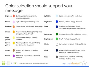
Color psychology
I’m partially posting this for folks who just attended the second part of the webinar series that I just did for Solvate about presentation design.
I’m not a fan of debating color schemes based on individual preferences or “feelings” that have nothing to do with one’s content. I prefer choosing colors based on the feelings you want your audience to have about your content. So, I refer to this handy dandy page from Pantone’s Guide to Communicating with Color as often as possible. It’s super awesome when working with American audiences. If you’re going international, well, it’s tougher 🙂 Check out some other resources – or something form me at some point. More on that once I get my stuff together.


Thanks, this is very helpful!
I’ve become a big fan of Adobe’s “Kuler” (http://kuler.adobe.com/)for setting palettes.